
This second-week record covers 12–18 October 2026 and was compiled on 19 October. It preserves the state of the work when the diary was written; proposals, prototypes, and check results refer to their respective points in time.
This detailed, sanitised account was compiled from work records and my own description, and I have reviewed and confirmed it. It retains the questions I raised, the methods I used to organise the work, and the process of making changes.
This week, I continued working through questions left by the previous round of research and extended the work into website content, information architecture, visual designs, and runnable prototypes. Often, the material already existed and a page had already been made. The harder part was explaining why that content belonged there, how a judgement followed from the sources, and what problem a change actually helped a reader solve.
Searching, extracting primary material, calculating, writing, making images, coding, and technical checks all involved AI collaboration. I continued to raise questions, review candidate results, and decide which changes were worth keeping. Looking back, I want to describe those roles and actions accurately.
Review the whole body of material before deciding what to investigate further
I first asked for another review of the complete report, rather than selecting only the section most in need of revision. The review needed to check both whether each part answered its own question and whether the parts connected: what problem did the background establish, what criteria did the comparison use, and what evidence did the suggestions rely on?
This did not mean starting every source check again. Material that had already been checked and remained usable was retained; gaps that could affect the conclusions were investigated specifically. That avoided dismissing all the earlier work while also preventing the report from simply accumulating paragraphs without making its main judgements clearer.
I also asked for specific review comments. “The analysis is not deep enough” did not say whether a key source was missing, existing material had not been used in the comparison, a condition had been skipped in the reasoning, or the prose had failed to explain a judgement already reached. Each problem called for a different response. Adding sources could not solve all of them.
Align the conditions of comparison before putting figures in the report
The data checks returned to the original tables. In one case, the draft compared a subgroup with the overall group that contained it. I questioned whether that actually answered the question about differences between groups. I asked the collaboration to return to the same source table, adjust both the numerator and denominator, and recalculate using consistent units and time periods. The prose, table, and chart were then updated together, rather than replacing only a sentence in the conclusion.
I was especially dissatisfied when figures appeared but the prose merely restated the table. I asked the collaboration to find meaningful contrasts within the existing data and explain how they affected the judgement. For example, ranking by frequency and assessing consequences can point to different priorities. When comparing the same type of issue across groups, each denominator must be checked before counts are treated as a measure of relative size.
The categories needed checking too. Some sources group observations by what happened, some by cause, and some organise them around a particular topic. They cannot be assembled into a single, apparently exhaustive ranking of mutually exclusive categories. I asked to separate broad coverage from a deeper look at selected topics: the overview should state the range examined, the selected topics should explain why they merited further attention, and the remaining material should keep its boundaries visible.
After one review round, I asked again whether the chosen topics had been presented as though they adequately covered the whole. The revision did not expand every category into an equally long study. It clarified the scope of the overview, retained the complete categories for checking, and explained why those topics had been selected. This made both the range investigated and the choices behind the deeper analysis visible.
None of this involved collecting another batch of figures. The collaboration recalculated existing tables and brought the subjects, definitions, and comparisons back into the prose. What I reviewed was whether those comparisons changed the analysis, not whether the number of charts had increased.
Examine existing approaches before suggesting a new feature
A recurring leap in the research was from “there is a problem” straight to “we need to add a feature”. I asked to unpack the steps in between: how is it handled now, under what conditions does the current approach fall short, is the gap in information, tools, resources, or coordination, and who is in a position to act?
When checking cases, I asked to distinguish knowing about a problem from having the means to address it, then to test whether the proposed tool could really change each kind of obstacle. The analysis could not assume that missing information was the main cause. It also had to consider whether the tool fitted the setting, what resources were available, how work was organised, and what sustained record keeping would require.
I also asked to retain research results that showed no improvement. A change in an intermediate measure does not automatically establish a better final outcome. When a combined intervention works, its effect cannot all be assigned to one part. The collaboration returned to available original texts to check methods, tables, comparison conditions, and results before deciding how to use the studies in the report.
At the same time, incomplete sources were not a reason to stop analysing. I asked for a clear account of what the available evidence did support, followed by the conditions under which the judgement might hold and what still needed testing. We could make a conditional case, but could not directly convert an external study's results into the effect or return of a proposed approach.
My own understanding shifted as well. I had been inclined to connect “detect and alert promptly” directly to “the problem will improve”. I began asking what happened after an alert: who checks it, whether it can change practice, and how any adjustment is checked afterwards. This first changed the questions I asked and the revisions I prioritised. A more complete explanation of the process still needs real-world testing before it can establish improvement.
Put problems found in the presentation back into the report first
After the report was revised, the collaboration made a presentation with native charts, tables, and notes. I went through it page by page, continuing to question whether the comparison groups were appropriate, whether an observation supported the stated conclusion, and exactly which step a suggestion would change.
Some problems appeared on slides, but their source was the report's reasoning. I therefore asked for the report to be corrected first and the presentation brought into line afterwards. Smoothing out one slide would otherwise leave the same leap in the prose, ready to reappear in the next export.
Later revisions separated the main line of argument from material kept for checking. The main line explained the key judgements and choices; detailed tables, complete categories, and longer explanations remained available for reference. I also asked each part to have a clear role, so that the report did not begin arguing for a particular proposal before it had explained the problem.
Organise versions so it is clear which one can be used as evidence
After repeated revisions, candidate drafts, old exports, and check records could easily become mixed up. I asked for the current authoritative draft, reading copies, presentation material, and historical snapshots to be identified separately, so that we would not later have to guess from a filename which version was current.
The collaboration organised duplicate material, preserved mappings from old paths and file hashes, and archived older drafts and records of differences. The current content continued to be maintained in the original main draft. Historical material remained available to trace when a sentence changed and what supported it.
When work moved between directions, I also asked to fix a version that could be returned to before continuing. Each new round changed only the specified part and left an account of the changes. When older material needed to be reused, its source and version were checked first, so that later edits would not inadvertently overwrite previously reviewed content.
Delivery checks had several layers: whether the prose was in sync, charts and citations were complete, pagination and fonts were readable, and the file actually opened or downloaded matched the intended version. Completing a content edit did not mean every other format had automatically been updated; each needed its own confirmation.
Study what the website's content does before counting pages
For the website, I first asked for a map of existing content and routes through it. Beyond the menu, the links in the body and footer needed separate checks: did the same label lead to different kinds of content, could a visitor get from a list to its detail page, and could they return to a suitable place after reading it?
This was more useful than counting pages. The existence of a section did not mean it fulfilled the role suggested by its name. Information being somewhere other than expected did not mean the site lacked it entirely. The review needed to distinguish missing content, unsuitable placement, insufficient explanation, and wording that still needed checking.
I also requested a comparison of several ways to organise the whole site. Combining pages might reduce navigation steps but make a page too long and its information hard to find. Keeping separate pages made them easier to share and read in depth, but required clear entrances and routes back. We used the same set of visitor tasks to compare where content belonged, how it would be found, and how it would be maintained. The page count was a consequence of those decisions.
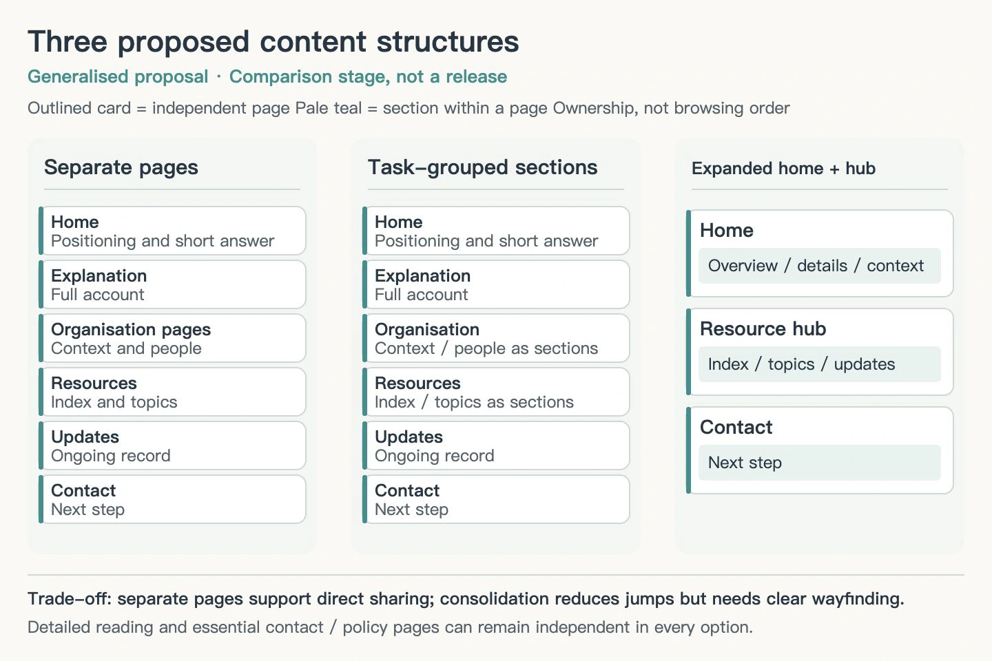
To avoid judging only whether structure diagrams looked tidy, the collaboration also followed actual routes from an entry point to a detail page and back. I asked to consider “has its own URL” separately from “requires an extra click during a visit”, and to distinguish the short answer a homepage could provide from material needing a deeper read. The discussion became about how content connected, rather than simply whether to merge or split sections.
The collaboration turned the written relationships into diagrams to make the structure easier to discuss, retaining both an editable form and an image for reading. The lines in a diagram also needed to say whether they showed content ownership or a route someone would actually take; otherwise readers could mistake every connection for a required step.
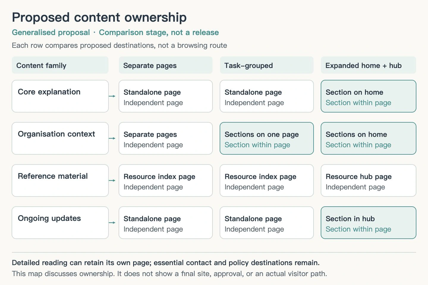
Follow reference websites through to how they help readers decide
I asked the reference study to go beyond each website's first screen. The collaboration examined navigation, comparable pages, article layouts, content hierarchy, and how explanations, resources, and contact routes connected.
Comparing pages of the same kind could overturn an initial summary. Having a title, main text, questions and answers, and a contact link in common did not mean everything in the middle was the same. A shared layout did not mean each page answered the same question. We needed to see which parts stayed stable and which changed with the topic and use case.
For specific checks, the collaboration laid out paired pages' headings, main content, and final links side by side. I asked it not to call them the same template just because they looked similar, but to describe the role and variation of their middle sections. The analysis recorded which organising methods might be useful and under what conditions. Page-by-page observations and their sources stayed in the working material.
For interactive elements on reference sites, the collaboration changed states, adjusted assumptions, opened details, and returned, to check how content related across the experience. Some results came from a fixed formula or a local simulation and had to be recorded as such. A visible change on a page did not mean that a real operational system had completed an action.
The value of a reference was that it helped us ask a more precise question, not that its form could simply be copied. Adopting a pattern would still depend on whether it suited our content, whether the material was sufficient, and who would maintain it.
Extend website requirements to the complete visit
Early requirements analysis concentrated on which business information visitors needed. I asked to extend it to the rest of the visit: whether someone could quickly understand the site's purpose, read the text comfortably, learn from the images, predict where navigation would lead, understand the feedback after an action, and use the site on a narrow screen or with a keyboard.
These concerns did not all need to become homepage sections. More useful was checking whether each page fulfilled its own role. Someone new to the subject needed an overview and concrete examples. Someone arriving with a question needed a clear heading, a direct answer, and a path to read further. Someone ready to make contact needed to understand what they were filling in and what would happen next.
In writing this analysis, I first asked for general principles to be made concrete with visitor situations. When the added examples still read awkwardly, I asked for a new structure: what role the website played, who might visit, what they needed to decide, and how content and experience could help those decisions.
This work used public research, guidance, and observations of pages. User interviews that had not taken place could not be presented as fact. A design used by a reference website was an observable example, not direct proof of user preference.
Give visual changes a reason and review each page in full
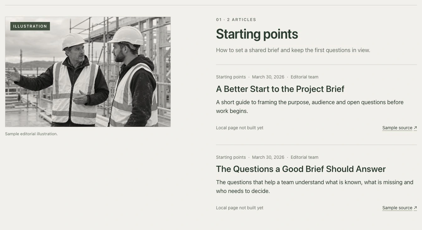
While reviewing designs, I made one requirement fairly clear: changes could be substantial, but they needed to be reasonable and necessary. A different set of colours, fonts, and buttons did not automatically make a design more suitable than the original.
The collaboration therefore compared which visual characteristics should continue and which content or interactions genuinely needed adjustment. Existing images also needed individual judgements: keep those that worked and address those whose meaning was unclear or could mislead. An image looking good and accurately explaining the content are two separate checks.
I also asked for more than a review of the homepage's first screen and isolated details. The review needed to cover complete pages, the balance between images and text, the rhythm between sections, and narrow-screen layouts. We would finish reviewing one page and resolve its issues before moving to the next. Where I had accepted part of a design, we retained that baseline and limited later edits to the current problem as far as possible.
Interaction checks also needed to separate “it works” from “what happens next is clear”. Once a menu opened, its text hierarchy, close control, and narrow-screen readability still needed attention. For a form, the collaboration used fictional details locally to try blank submission, correction, review, and returning to an earlier step, checking whether prompts helped someone continue. No real details were sent during these checks, and simulated states were not presented as real business outcomes.
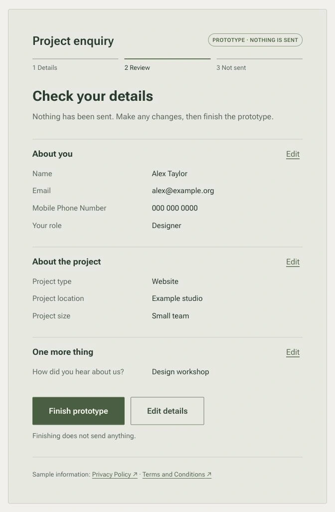
Different exploratory directions were saved separately. Fixing a version that could be revisited before testing a new direction let us explain what had changed. It also kept candidates from overwriting one another, which would have made comparisons difficult and previously accepted states hard to recover.
Check the character and the animated scene on their own terms
The supporting character went through several visual revisions. I first checked whether it suited its purpose, then whether it had a recognisable identity and character. Later, too many details made the whole less coherent, so I asked to simplify it and reconsider the local structure and colour relationships.
The accepted appearance was documented as guidance for later use, with adapted assets needed for different formats. A picture that looks three-dimensional, an editable model, and an animation that can play are distinct forms. A similar appearance does not make them the same completed item.
An interactive scene raised a different set of questions. I asked for users to be able to see the whole scene and control it themselves before checking whether the moving parts worked together. A convincing overview did not guarantee suitable details up close; one object moving did not guarantee that the sequence of movement felt natural.
On a running page, the collaboration checked free interaction, pausing and resuming, loop transitions, loading, and returning, and saved actual screenshots and recordings. A design looking feasible, a page running in a browser, and the experience on real devices each still need their own evidence.
A reading page needs more than an attractive outline
The first version of a reading page had a structure and placeholders but lacked the full content. I explicitly asked for the main text to be filled in. A reader should be able to understand the current situation, evidence, choices, and matters requiring further judgement directly, rather than receiving a writing plan.
Once the content was added, I pointed out that terminology, numbering, and internal discussions appeared too early. Rewriting only the opening, or hiding difficult material further down, would not fix the document as a whole. I asked for a full read in the order a first-time reader would encounter it, removing repetition, explaining necessary terms, and giving each part a clear job.
The edits were concrete: codes and numbers used for collaboration were moved out of the main reading path, and headings were organised around subjects readers could understand immediately. The opening set out what needed answering before developing the evidence and options as required. Substantive judgements appeared in the main text; readers did not have to open a string of appendices or collapsed sections to find them.
The collaboration then reorganised the page so its main text could be read directly, while long diagrams could be opened for a closer look. It also checked table-of-contents navigation, position after refresh, narrow-screen table scrolling, and expanded images in practice.
For later targeted edits, I required changes to only the specified sentence or table row while retaining everything else. After syncing, we checked both that the material meant to be removed had gone and that neighbouring text, links, and tables remained. Precise edits and a complete reread serve different purposes; a broad rewrite is not a substitute for every small correction.
Explain the choice in a presentation before asking pages to illustrate it
When preparing a presentation, I settled my narrative order again: first explain why this kind of page was needed and how it would help readers understand and decide, then show the specific proposal. The prototype did not need equal time for every page. It could follow one complete visitor route from initial understanding through deeper reading to a next action.
I asked for natural transitions and for numbers and screenshots to have clear purposes. If a figure lacked a source, it was left out. Illustrative material was labelled as illustrative. A smooth story could not turn a step that had not happened into an accomplished fact.
I also tried a small set of search terms for related content. The collaboration compared which topics similar words actually led to and distinguished advertisements, web results, and automatically generated summaries. This helped explain the relationship between keywords and visitor intent, but one set of results could not establish stable rankings, traffic, or growth.
When discussing an additional interactive feature, I also changed the order of its introduction: explain why it was being considered, look at existing public examples, then describe the help it was proposed to offer. I continued to revise visual details and interface language that did not fit. A clickable or expandable demonstration in a presentation still did not mean it was connected to a real service.
For another type of presentation material, I first proposed manual playback. The collaboration compiled a shortlist of video references for discussing the story and storyboard. Preparatory material needed to explain its expressive purpose and transitions. At that point it was concept development, not a finished film or a validation of a real process.
Examine the research process itself
This week, I also asked whether there was a reusable research process that could cover the whole task. A list of tool names would not answer that, so I asked which steps handled searching, source organisation, structured comparison, locating material within media, and independent checking.
The collaboration then ran several comparison rounds. It fixed the task and inputs, carried out fresh research, review, and revision without access to the old draft, and compared the results after they were frozen. The checks looked beyond source counts to whether key questions had been answered, citations supported the judgements beside them, and the report helped a reader make a real choice.
I repeatedly asked why omissions remained. The diagnosis went back to actual queries, reading of original material, follow-up leads, and review actions. It distinguished material not found, leads found but not pursued, reading only an abstract, restricted access, and material obtained but not used in the argument. Filling fields and passing citation-format checks could not guarantee sufficient substance. I also asked an independent review to challenge the choice of topics and the smaller questions that had to be answered, rather than only inspecting the sources already in the draft. Closing known issues did not prove there were no unknown omissions.
For example, after finding a relevant study, we still needed to establish whether we had actually read its abstract, full text, tables, or appendices, and whether its references to subsequent work had been followed up. I asked for a diagnosis of the specific point where the process had broken down, followed by a change to that step. Repeating “search more comprehensively” in the next prompt was not enough.
Time comparisons also needed to include interruptions, restarts, further searches, reviews, and integration in the same execution chain. Parallel stages could not simply be added together, and cached use could not be counted again under other usage. Without complete costs or a baseline for the old process, there was no reliable percentage for time or money saved.
These experiments prompted additions to the process: an inventory of original materials, following leads by question, pausing drafting for a review, and checking dependent passages after a targeted edit. I asked for coverage and depth of content to be evaluated separately. Some procedural rules had local tests, while the later criteria for judging content still needed validation through research. A rule running successfully could not be reported as proof that research quality had improved.
Looking back, much of the week's work was turning broad requests into questions that could be checked. Were the comparison conditions consistent? How did the material support a judgement? What job did a page have? Was there a reason for a change? Could a reader follow the content onwards? What evidence would show that a step was actually complete? Research drafts, comparison records, structure diagrams, editable designs, running prototypes, and check records gradually accumulated through that process.